
The short answer
Use short labels, generous contrast and an HTML explanation that survives image scaling.
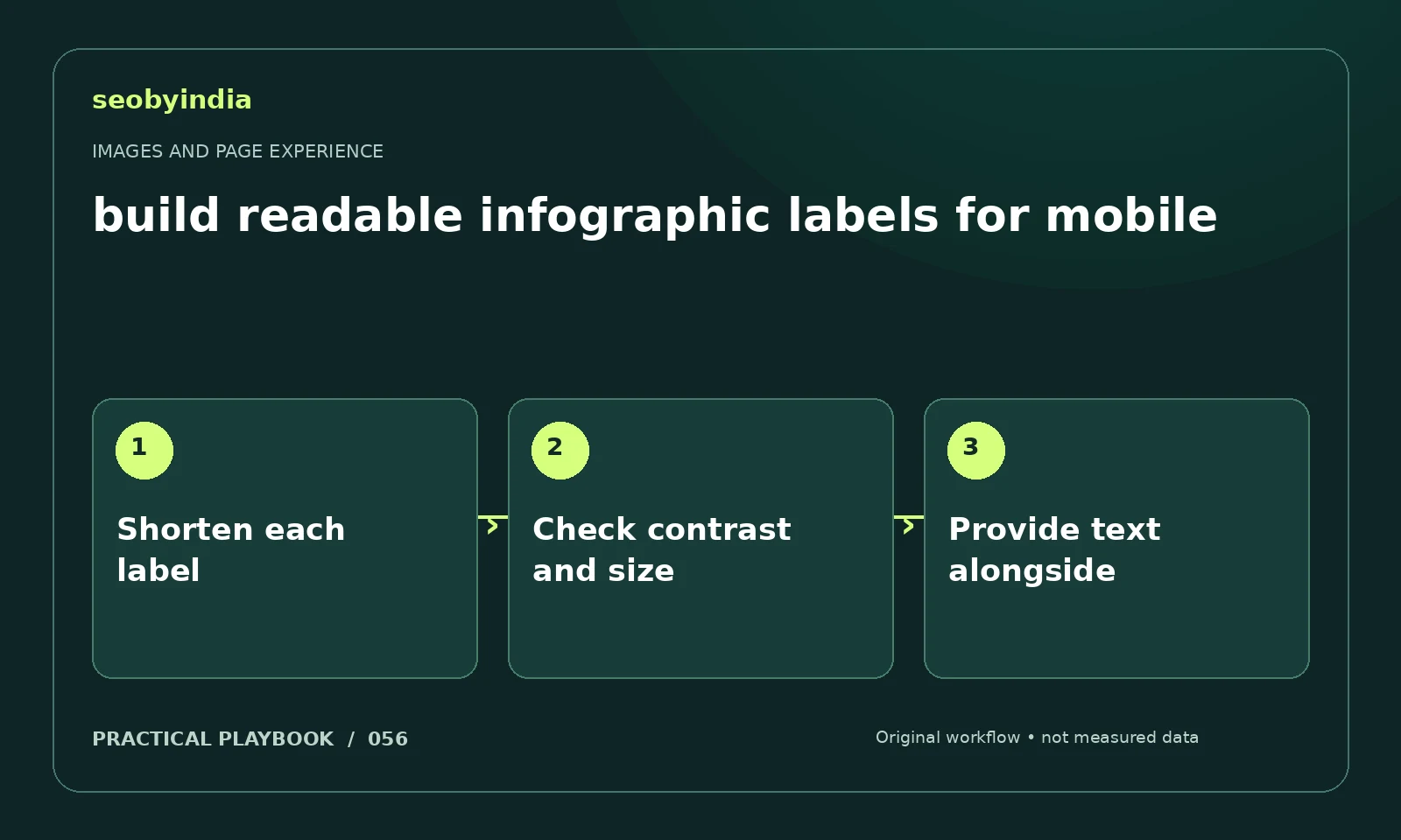
A three-step workflow
Shorten each label
Replace long sentences with short action labels. The picture should communicate the structure while the article holds the detail.
Check contrast and size
Check the scaled image on a narrow screen and use sufficient contrast. Do not depend on fine lines or tiny legend labels.
Provide text alongside
Repeat essential labels and instructions in live text. Readers using assistive technology or small screens should receive the same useful message.
Illustrative example
Put the decision in context
A three-card workflow should use short verbs such as inspect, compare and verify. Put detailed instructions in text below rather than shrinking them into the picture.
What to record in your working sheet
Keep the evidence beside the decision so the work can be checked and handed over. For this task, use these fields:
- Page URL and image or interaction
- Reader purpose and expected behavior
- Observed usability or loading issue
- Asset change and before/after check
A mistake to avoid
Exporting desktop presentation slides directly as mobile article images.
References and further reading
The workflow and illustrative example are SEOByIndia editorial guidance. Use the linked primary documentation for platform requirements; interfaces and policies can change.
Need help applying this to your site?
Share your website, the problem you are investigating and the evidence you already have. We can discuss a focused scope and the next useful check.
Discuss a page experience review