
The short answer
Use motion to explain a process and provide a stable reading experience and reduced-motion alternative.
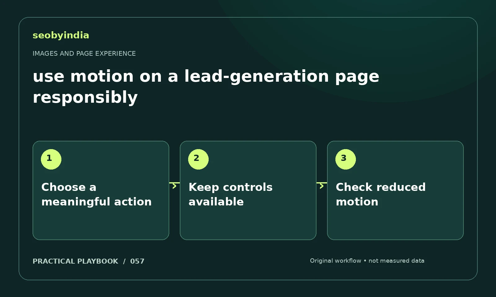
A three-step workflow
Choose a meaningful action
Decide what the motion explains and what a reader gains from seeing it. Keep decorative movement subordinate to the page's purpose.
Keep controls available
Provide usable controls for longer media and avoid movement that interferes with reading or form entry.
Check reduced motion
Check reduced-motion preferences and the static alternative. Make sure essential instructions remain visible when animation is disabled.
Illustrative example
Put the decision in context
A subtle connection animation can illustrate a visibility audit, while the form and its labels remain static and easy to use.
What to record in your working sheet
Keep the evidence beside the decision so the work can be checked and handed over. For this task, use these fields:
- Page URL and image or interaction
- Reader purpose and expected behavior
- Observed usability or loading issue
- Asset change and before/after check
A mistake to avoid
Autoplaying distracting animations behind important copy.
References and further reading
The workflow and illustrative example are SEOByIndia editorial guidance. Use the linked primary documentation for platform requirements; interfaces and policies can change.
Need help applying this to your site?
Share your website, the problem you are investigating and the evidence you already have. We can discuss a focused scope and the next useful check.
Discuss a page experience review