
The short answer
Reserve space for image dimensions so text and buttons do not jump as media loads.
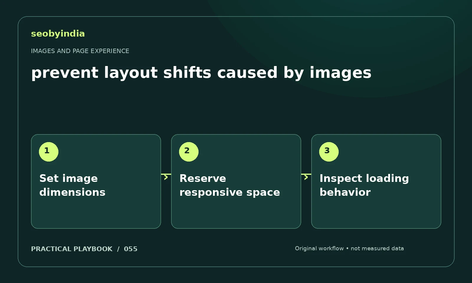
A three-step workflow
Set image dimensions
Add accurate image dimensions or an equivalent aspect ratio in the page layout. Keep responsive sizing proportional.
Reserve responsive space
Reserve the expected image area before download. Check surrounding text and buttons for unintended resizing as resources arrive.
Inspect loading behavior
Load the page under slower conditions and watch for movement. Fix the element that shifts rather than hiding the symptom with arbitrary spacing.
Illustrative example
Put the decision in context
A checklist illustration loads above the enquiry button. Explicit dimensions or a stable aspect ratio can preserve the layout while it downloads.
What to record in your working sheet
Keep the evidence beside the decision so the work can be checked and handed over. For this task, use these fields:
- Page URL and image or interaction
- Reader purpose and expected behavior
- Observed usability or loading issue
- Asset change and before/after check
A mistake to avoid
Fixing a moving button by adding arbitrary empty space.
References and further reading
The workflow and illustrative example are SEOByIndia editorial guidance. Use the linked primary documentation for platform requirements; interfaces and policies can change.
Need help applying this to your site?
Share your website, the problem you are investigating and the evidence you already have. We can discuss a focused scope and the next useful check.
Discuss a page experience review